As discussed during the monthly meeting, we look forward to your input on the logo!
1 Like
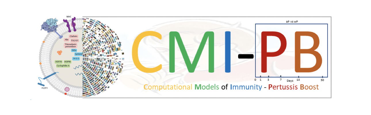
This is nice and a great start. Some minor points:
- I think the yellow font used for “Computational” is too light and is thus hard to read.
- The molecular labels in the cytosol are superfluous - no one will be able to read them and why would we want them to?
- The background image is interesting and I get the point of the coughing child but at the minute it looks like a water-mark left in by mistake.
- What aspect ratio are you aiming for - is for website banner image only?
2 Likes
Great effort and initial design concept!
- I agree with @bjgrant that background of “coughing child” is too light and difficult to discern.
- The symbolism of the box enclosing the “PB” characters is obvious to internal team members, but public users might not understand its significance. Perhaps replace it with some version of the graph showing the drop in pertussis following wP vaccination but subsequent rise following the switch to aP?
2 Likes